Manga Drawing Process: Inking - Part 3

How to Hatch?

Hatching is used to form tones for your manga utilizing ONLY pen techniques. Mangaka who uses this technique minimizes the usage of screentones and thus being a little more environmental-friendly and cost saving.

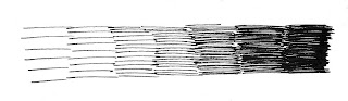
Basic hatching technique is done using parallel horizontal line formation, you'll get darker tones if you draw the lines closer together. This is a common hatching technique that is used for any objects and any surfaces.
A variation of this technique is by hatching the line in perpendicular form. This is more suitable for objects with steel, smooth surface or cylinder and round objects such as street lamps, iron ball and so on. Similar to the previous style, closer line formation creates darker tones.
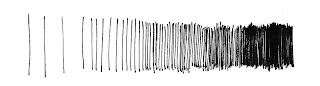
Create variety by hatching with shaky lines further implements the "steel" feeling of the object. Or it could used for wooden objects, try experiment with them and you'll understand which is suitable for which.
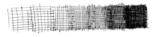
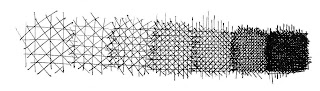
Cross-hatching the horizontal with the perpendicular lines creates different tones that's commonly used for large, flat surface such as floor or walls, or even the table surface goes well with cross-hatching technique.
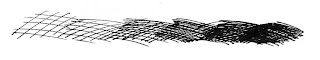
If you would adjust the angle of the line and hatch like below, the tone will now looks more like a fish net, usage variety - well, anything goes well with a net cross-hatching. It is even suitable for living objects' toning.
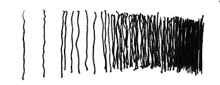
However, living objects such as human and animals is done a little differently, the angle of the lines are sharper and usually, slightly curved lines are used to illustrate the different curvature parts of the living creature.
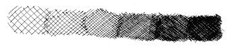
To create tighter, darker tones, try cross-hatching with different angles of line. Combining the following two cross-hatching style, we create crystal like tones, usage - varies.
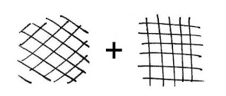
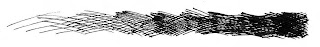
The hatching style below is a unique hatching technique, you can use this to represent the texture on the object surface or to illustrate leaves on the tree branches. It may look complex but it's pretty simple actually, just keep drawing in a figure "8" shape at different angles and directions using single line only.

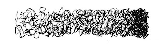
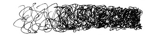
Another unique tone is done using dotting techniques, create sandy surface tone. Darker tone is created by arranging the dots closer to each other.


PREV / NEXT

Welcome!

Welcome to Mangaka's Journal, a place where becoming a mangaka is no longer a dream but a reality...
Just kidding! ^^

Actually, I'd just like to share with you some experience of drawing manga, how you go about becoming a manga artist and some discussions on doubts and questions that revolved around this area of topic.

And as I've mentioned before, I'm just sharing my own experiences here so if there're anything that I've mentioned wrongly or if you have different opinions, feel free to drop me a comment or message or just simply email me at mangakasjournal@gmail.com

Hopefully through this exchange of experiences and thoughts, the ideal of becoming a mangaka is no longer a dream, but a reality for anyone who'd made up their mind in this career!

Sincerely yours,
Wilson

On to Site Map

Manga Drawing Process: Inking - Part 2

How to Ink?
There are many ways to ink your manga, take Inoue Takehiko sensei for example, he uses ONLY Chinese brush for his inking in Vagabond, but of course, this is what I call - the expert level, so for us, let's forget about using Chinese brush alright? We'll stick with our good old Dip Pens and Fine Point Pens for our manga work!

Technically, there are two ways of inking:
You can ink your manga using long smooth lines, the good thing is this can be very time saving BUT provided that you have very good control.


Another way you can ink your manga is by building up your lines using short repetitive strokes, almost like how you do with your pencil sketch.
How to build up lines with short repetitive strokes:


This will help prevent shaky inking but it is not suitable if you're preparing a full colour work because this way of inking tend to build up thicker lines.

Basic Drawing In Manga Style

You may be asking now, how to draw a face? How to draw a dog? How to draw a car? How to draw a building? And the list could go on forever.
Well, it's not that hard y'know, all these can be done with a little more practice, a little more observation, a little more studies, and the key element - by first understanding the skeletal structure of anything and everything that you're trying to draw in your manga.

Skeletal Structure Concept:

By skeletal structure, I'm not asking you to draw a skeleton in your manga. What I mean here is the basic frameworks or shapes that gives an object its outlook. For an example, a book can be drawn by first sketching out a rectangular cube, which is the skeletal structure of a book:


No matter it is an open book or a closed one, the skeletal structure remains the same, which is the rectangular cube. Meaning, I can draw anything in my manga as long as I've got the grasp over the basic shape of the object that I'm drawing.
So with the skeletal structure concept in mind, let's move on to drawing complex objects!

Manga Drawing Process: Inserting Text

You have two ways of doing this - using computer with software tool or you can just ask your publisher to do this for you.

In Malaysia (don't know about other countries), the text inserting procedure is usually being done by the publishers, what you do is that you write your texts on a tracing paper, the positioning of the text is on the exact location you want it to be placed on your manga. Then you clip the tracing paper together with your manga (or just put them together in an envelope) and send to your publisher, who will do the rest for you.
It is wise to mark the page number at the bottom of your tracing paper to make life easier for the publisher to identify which tracing paper is for which manga page.

You may also edit the texts yourself using your computer, just install an editing tool such as the Adobe Photoshop, or if you think it's too expensive just use your Paint program that is readily installed in your computer. Of course, you don't really have much variety for the text font using the Paint program.

Photoshop or other significant software tool however, is much more user-friendly, you can download other font design if you're not satisfy with those that are already available in your directory. You can also play around with their font editing tools or even insert other textures, making your texts more interesting than ever. And the best feature provided, in my point of view, is the layer tool, with this you can write your texts on a separate, overlapping layer. So if you're using Photoshop to insert your texts - exploit the ussage of the layer tool!

Manga Drawing Process: Screentone & Touch Up - Part 1


Let's look at the image above, the finalized inking of a manga. Yeah, I can stop right there and start selling my work but I'm not too happy with it. I think that Little Red Riding Hood's dress is red and eventhough this is a black & white manga, I still want something to represent that colour. So what do I do now? - screentone.

Screentone is a process of setting up tones for your manga, you can do this using actual cut and paste method or lazy people like me, uses their PC for the job.

Pros and cons - actual screentone is bloody expensive in Malaysia and it is difficult to use, and you also risk to cut your original artwork if your knife wasn't sharp enough or you put in too much strength in the process; but once you've got the hang of it, it is actually faster than using software and you can combine with other tools such as overlapping with white ink lines, utilizing different cutting techniques and the friction of your knife with the screentone surface to create different unique effects.

Using software however, is much easier than actual screentone, and it's a one time investment, get yourself a Photoshop and a WACOM tablet and you can use it for your manga as long as your computer's still alive. You have no worries for wrong doing in your work as well because you can always Undo whatever that you don't like. The cons, it is harder for you to create special effects - you need to use the right brushes, you can't draw straight lines with your templates and you'd take much longer time to create your effects.

So it's a little bit of pros and cons from both medium, just choose one that you'd like to use most. For me, I use Photoshop and WACOM tablets and have a jolly good happy day everytime i draw my manga! ^^

Manga Drawing Process: Inking - Part 1

This is an important and (if not handed properly) the most nasty procedure in your manga drawing process. Why? Because there's no turning back in this process, one stroke is one stroke, and if you messed it up there's no "erasing" or "undo" in this stage - you're done for it! Throw the messed up sheet in your hand and REDO EVERYTHING FROM SKETCH! And if you keep messing up like this you'll loose interest in drawing manga VERY soon!

So what is the biggest problem in inking manga? Yea, I know, "my hand's shaking... I can't draw a smooth straight line!"
My advise to handle this problem:

~ change the way you do your inking - sometimes drawing long, smooth line just isn't for you, so change the way you ink your manga, I'll get into this later.

~ relax and concentrate - don't hold your pen too tight, just relax and focus on your drawing.

~ KEEP PRACTICING! - practice makes perfect, but no one's perfect, so why practice? But let's put it like this - if you DON'T practice, you'll get NO WHERE near to be even good. So if you want to make something GOOD out of yourself - KEEP PRACTICING!

Inking Styles:
This is for full colour illustration and heavy screentone manga. Thin, fine lines are used for the inking, and it is drawn evenly throughout the entire picture without putting any stress on any portion of the picture.

This is to allow clear, clean space for colouring and screentone purpose.


If you had noticed the difference with the previous style already, this picture were illustrated with different weight of strokes throughout the entire artwork. The heavy strokes were used to represent the shadow of the area, hence it gives your artwork more sense of volume and dimension.

This inking style prepares the artwork for heavy screentoning, one of the mangaka that uses this style for heavy screentone was Fujisawa Tooru sensei, the creator of Great Teacher Onizuka.
Otherwise, it is used for hatching purposes.


The third style introduced here utilizing only pen techniques for toning, it's known as hatching or cross-hatching where the mangaka uses different weight and style of strokes, crossing them together to represent the tones of the artwork. First, the artwork is prepared with the second style as mentioned above, then cross-hatching the darker area for tones. Or you can just cross-hatch everything from the beginning, it still produces the same thing if not more artistic manga!

For references, try Vagabond, a manga by Inoue Takehiko sensei, who's also the creater of Slam Dunk.